Showing posts with label beautiful books. Show all posts

Monday, 3 March 2014

March madness - a cover update and a competition

I am rich in proof copies!
First, some updates. As some of you may have already seen, proofs for Murder Most Unladylike are finally in, and they look stunning. The book is finally out in the world and being read - and that's an awesome and terrifying feeling. I can't wait to hear what you all think of it, and I can't wait to find out whether you manage to crack my whodunit. (Though, a caveat: if you do read it, you should consider yourself immediately sworn to silence as to the identity of the murderer. This blog is a spoiler-free zone!)

It's been a fairly quiet month on this blog, but that's because I've been busy writing the sequel to Murder Most Unladylike. Due for UK release in spring 2015, its title (at the moment) is Arsenic for Tea - and as of Sunday night, Draft One has been officially FINISHED. Now comes my favourite part: the edits!

I have written a bit on other blogs, though: a piece for the Author Allsorts about diversity in children's and YA fiction - and why I think that a diverse supporting cast will never make up for a lack of diverse narrators.

And an interview that I gave my lovely agent, Gemma Cooper, about the UK cover for Murder Most Unladylike. And talking of the cover . . .

I began last month with a cover reveal. It was a great cover - your enthusiastic reaction proved that. But since then, a decision has been taken by the wise people at Random House that a few small tweaks would make my book, and the series as a whole, look even better. And by golly, have they delivered.

The new-look Murder Most Unladylike still has the same beautiful illustrations and the same gorgeous title font as the original. In essence, it's absolutely the cover that I loved and approved last month - but it now has a different background colour, and a slightly simplified design. I hope you'll agree with me that these small changes have made it look even more wonderful than it did before.  I'm so proud to now be able to share the final look with you, and I hope that you'll fall for it all over again, just like I did!


And now, to celebrate the new cover direction, I'm delighted to be able to finally make good on my promise of a proof giveaway. That's right, it's competition time! I've got ONE very special proof copy of Murder Most Unladylike to give away to one of you lovely people.

All you have to do to win it is:

Tell me what your all-time favourite murder mystery is, and why.

This competition is now closed. Thank you to everyone who entered - and congratulations to the winner!

Monday, 3 February 2014

Murder Most Unladylike Cover Reveal: Meet My UK Cover!

As some of you may have heard, I have a book coming out in May. Murder Most Unladylike is the first book in The Wells &Wong Mystery series, about Daisy Wells and Hazel Wong, my 1930s crime-solving schoolgirl duo.

From the official synopsis on the Random House website:
When Daisy Wells and Hazel Wong set up their very own deadly secret detective agency at Deepdean School for Girls, they struggle to find any truly exciting mysteries to investigate. (Unless you count the case of Lavinia’s missing tie. Which they don’t, really.)

But then Hazel discovers the Science Mistress, Miss Bell, lying dead in the Gym. She thinks it must all have been a terrible accident – but when she and Daisy return five minutes later, the body has disappeared. Now the girls know a murder must have taken place . . . and there’s more than one person at Deepdean with a motive.

Now Hazel and Daisy not only have a murder to solve: they have to prove a murder happened in the first place. Determined to get to the bottom of the crime before the killer strikes again (and before the police can get there first, naturally), Hazel and Daisy must hunt for evidence, spy on their suspects and use all the cunning, scheming and intuition they can muster. But will they succeed? And can their friendship stand the test?
The book will be published on May 8th in the UK as part of Random House Children's Publishers' Corgi imprint, who are really going out of their way to make it look fabulous. There's a map, there are character lists - and I can now reveal that there is the most fantastic cover.

It has been designed by the wonderful Nina Tara, who has worked on covers for Diana Wynne Jones and Agatha Christie (!), and what she's done to my cover is fabulous.

Are you ready? Here goes . . .


It's fun, stylish and brilliantly quirky, and it really captures the spirit of my book. I love the slightly Alice in Wonderland feel Nina's managed to achieve, I love the tagline, and I LOVE the lettering. Every time I look at it, I find a new detail to be excited about.

I can already imagine this on shelves - and I don't know about you, but if I saw it in a bookshop I'd pick it up. It's simply gorgeous.

If you're interested, Murder Most Unladylike is already available for pre-order: from Blackwell's, Waterstones, Foyles and Amazon.co.uk, among others.

And I'm also delighted to say that advance review copies will be released into the wild extremely soon - and when they are, I'm going to be running a competition on this blog to give away a copy. So if you want the chance to read about Daisy and Hazel three months early, watch this space!

Saturday, 21 December 2013

2013: My year in 13 books

Greetings, festive friends! I've had a busy month. In fact, I have had the sort of month that made me want to crawl under a rock and put up a sign saying I NEED TO JUST LIE HERE FOR A WHILE AND BREATHE.

But now I am on holiday (yes! A holiday! For two whole weeks!) and I am rediscovering the concept of leisure, which is apparently a thing that some people get. I just got into the spirit of it by reading the whole of Holly Black's Curse Workers trilogy in 72 hours, and it turns out that leisure is great.

In case you want to keep up to date with my internet activities, I have:

- written a Dear Santa letter for Space on the Bookshelf about why I think there should be a Diana Wynne Jones book in every child's stocking this Christmas.

been hanging out at Author Allsorts again, most recently talking about my top tip for a big edit.

And now, to the main blog. It's the end of the year, which is traditionally the Time of Listmaking. And of course, because my entire life is about books (really, it is, if someone stopped me and asked me to sum up my life in one single word I would just shout "BOOKS!"), here is my year as expressed in 13 of them. I've linked to my reviews of them, where that applies - and I've also given myself a bit of leeway on exactly when I read them. If it was sort of kind of around that month, it counts.

JANUARY 


This was a Christmas present that I read at the very beginning of January, and it got my year's reading off to a start just as magical as my year itself. Dark, gorgeous and headily wonderful, this book was the perfect beginning to an amazing year.

FEBRUARY 


I was lucky enough to review this for The Bookbag when it first came out in paperback, and I've been yelling about it ever since. I like that this is February's book - February is the month of love, after all, and this book makes you fundamentally question everything about the reality of adult relationships. (Don't worry, this has nothing to do with my own life.)

MARCH 


Again, I was lucky enough to get an advance review copy of The Shining Girls from The Bookbag. I admit, I was upset by it - it's so brutal - but it's also utterly brilliant. Seriously not for the faint of heart, but if you can cope with its horrors you'll find it incredibly thought-provoking and well written.

APRIL


I read this in my first months at Orion, and it just blew my mind. It isn't just a wonderful story, it's a wonderful concept - a narrative linked to found photos, which inform the text and are printed alongside it. It makes you constantly wonder if what you're reading is real, and the pictures themselves give you chills. It's such a well-published book, and though I love this book as a reader, I love it even more with my editorial hat on.

MAY


Another book that takes expectations and jumps up and down all over them. It's a middle-grade novel. It's about someone dying of cancer. It's heavily illustrated. Its pictures are the scariest thing about it. And it's fantastic. A Monster Calls completely transcends genres and reading levels. It isn't for children, it's for humans. It's a sad fact that a lot of people stil insist on being very foolish about the quality and importance of children's fiction, and this year my three-word response has become A Monster Calls. I win.

JUNE

The Leviathan trilogy - Scott Westerfeld


When I read Leviathan in June, it had been a long time since I'd been really excited about a trilogy. Then I finished Leviathan, and ran to the nearest bookshop after work to buy Behemoth. Literally. I ran. It's a steampunk adventure set during an alternate universe World War One, and it made my summer.

JULY


I've read a lot of fairy tale adaptations, but this one has to be head and shoulders the best I've ever come across. It felt totally fresh and completely real, and it proved to me that there really are endless places to go with any one concept, no matter how overdone it might seem to be. The kind of book that just makes me excited about fiction.

AUGUST


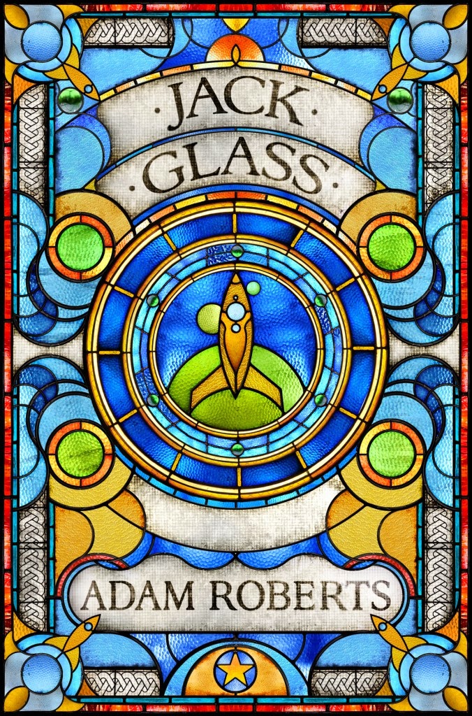
I went on holiday in August, so I've picked two of the best books from my holiday reading. If Tender Morsels made me excited about reading, We Have Always Lived in the Castle and Jack Glass made me excited about being a writer. They're both focused around a past murder - essentially, they're both crime novels - but they both do stunningly unique things with the genre. They're beautifully written, they're creepy and weird and smart and wonderful (and very, very different - Castle is a sort of domestic Gothic, while Jack Glass is Agatha Christie in Space), and if my books end up being even a tiny bit as interesting as these two, I will be very very pleased.

SEPTEMBER


This might just be my book of the year. It reminded me so strongly of my own teenage self, it's so engagingly written and it deals so lightly with such deep issues. And it's a bloody amazing love story. I can't sing Rainbow Rowell's praises highly enough.

OCTOBER


I was just gleeful about discovering this book, an Austen tribute that's not just a rehash. It's incredibly well written, it's extremely clever and it's a big, bold romance that's full of plot. I'd been reading a lot of children's and YA fiction when I picked Longbourn up, and this got me back into adult books again.

NOVEMBER


 This book just about broke my heart. I've read so very many books about World War Two, but this managed to jolt me right out of my general World War Two overexposure apathy. It's wonderful - and coincidentally, I got to meet Elizabeth Wein herself in November, which was pretty amazing.

DECEMBER


Another book that's as beautifully published as it is written and illustrated. We got a copy into the office, and we all crowded around it greedily, murmuring "silver foil! Purple edges! A TINY WEE BOOK IN THE BACK!" It's just touchable. It's also very very funny - and you all know how great Chris Riddell's illustrations are. What this book reminds me is that a) children's books are brilliant and b) children's publishing is brilliant. And I'm so very lucky to be a part of that.

So, those are my 13 picks. What are yours? What have you been raving about this year? What were your unmissable reads of 2013?

Sunday, 18 August 2013

Goodreads News and US vs. UK covers, Holiday Edition

Hello again! I am back from my holidays in America with several updates.

First, on the excellent recommendation of Nina Douglas, I have joined Goodreads. I now have a Goodreads author page, which links to this blog and has lots of info about myself and Murder Most Unladylike. You can friend me, follow me or mark the book as 'to read'. As you wish!

Henceforth, also, the reviews portion of this blog will take place over on Goodreads. You can now track what I'm reading on my page, and have a look at the books I've already rated.

Isn't that cool? I don't even need to tell you about all the books I read over my holidays - although I do want to specially mention The Brides of Rollrock Island, The Thirteenth Tale, When You Reach Me, Jack Glass and We Have Always Lived in the Castle because they were all (very differently) WONDERFUL.

-

I have also been in many bookshops. Working in publishing has clearly made my book nerdliness reach new levels. I'm noticing cover design and branding so much more than I ever have before, and about half of the photos I took in San Francisco were of US editions of books I'm familiar with in the UK. Because book covers are very interesting! This made me think about the UK vs. US covers game, and that made me want to do a blog of my own about it.

Therefore I am now pleased to present you with the redbreastedbird holiday version of US vs. UK covers. My photos of the US covers are on the left (or above), UK covers for comparison on the right (or below). Thanks to City Lights Books and Green Apple Books, excellent establishments both, for providing the material for all of these photos.


Tampa by Alissa Nutting


Tampa is a book that I read on holiday (and struggled with, actually - half of me thought that it was an extremely clever and thoughtful look at the nastiness of teacher/student sexual abuse, and the other half was just too horrified by how much detail it went into). I had the cover on the right ("Oh I see," said my boyfriend, poker-faced. "It's a book about men's shirts"), which I have to admire. Imagine getting that approved all the way to the shop floor! The US cover I think is great for very different reasons. From far away it looks like writing on a blackboard - but when you touch it, you realise that it isn't just flocked, it's essentially a carpet. It has this gross furry texture that you can't stop touching because you can't believe it's real - essentially, the US cover is the book in physical form.

Winner: UK.


Life After Life by Kate Atkinson  


Another pleasing US cover! I think the UK cover is too busy, and I dislike those random snowflakes. The US cover just looks sophisticated and really beautiful, while still managing to convey what the book's about.

Winner: US.


Scat by Carl Hiaasen


I love the background colour and font of the US cover, but I think it looks like it's being marketed to a younger audience than the UK book. It looks cutesey, sort of Pink-Panther-esque, whereas the UK cover seems more dangerous and adult. It's also a much cleaner design, and I like that.

Winner: UK.


American Gods by Neil Gaiman


 I like the US typeface, and the fact that it's got the World Tree on it, but I am in LOVE with Gaiman's UK covers. They're so dark and gorgeous. Why is the wing there? Who knows. But in terms of design and desirability, I think that the UK cover has the US cover beat.

Winner: UK.


Mr. Fox by Helen Oyeyemi


I love this book. LOVE it. I own the UK edition, which actually I really like - there's some subtle genderbending going on in the woman's outfit, and I think it's an intriguing image of her - but I have to admit that the US cover is a lot more successful at conveying what's going on in the book. Foxes awkwardly turning into humans, struggling into male and female clothes that don't fit them. It's neat and attractive and very weird, absolutely like the book itself.

Winner: US.


The Sisters Brothers by Patrick deWitt


Quite apart from the odd fact that the left US Sisters brother looks like Eddie Redmayne, the US cover does not compare well to its UK counterpart. The UK cover is so inventive, so iconic and so vibrant ... and then the US version is a dull sepia identicover that could be 50 other books about the Wild West. Snore.

Winner: UK, by a mile.


Children of the Jacaranda Tree by Sahar Delijani


Another really, really clear winner. The UK edition is Weidenfeld and Nicholson (aka my adult counterparts at work), so I guess I might be biased - but really, it's hard not to be impressed with it. It's gorgeously vivid, with colours that sing together, and next to it the US cover just looks like a pale imitation.

Winner: UK, again by a mile.


The One and Only Ivan by Katherine Applegate


The US cover, at the top, almost looks computer-generated. The drawing is very rounded and cute and (oddly, for a book with the word 'One' in the title) features Ivan with another animal. The UK cover, below, still looks appealing, but Ivan looks bigger, more like an adult gorilla - and crucially, he's alone in the spotlight. And I like the blue better than the dark green.

Winner: UK.
 

Eleanor & Park by Rainbow Rowell


Another book that I have been vocal about loving recently. The UK cover is Orion (work connection again!) and I think it works - it's very bold and fun - but the US cover is just so charming, simple and sweet that it's hard not to give it the edge. I love the way the ampersand has been made from Eleanor and Park's connecting headphones and I love the drawing of their heads.

Winner: US.


I generally find myself preferring UK covers of books, but I love the floppy way US paperbacks feel to hold. Basically, I like books. Hey, maybe I should be a writer or work in publishing or something. Crazy thought.

Friday, 16 November 2012

Bundles of Joy

Sarah Massini for Nosy Crow
First of all, I am so excited to finally be able to talk about the fact that Nosy Crow, a children's publisher I was lucky enough to do some work for a few weeks ago, is launching Stories Aloud, a new initiative that bundles digital audio content with their physical picture books.

Here is their blog post about it.

Basically, you open the book, you use your smartphone to scan the QR code and up pops an audio file that can be played alongside the book or listened to on its own. Isn't that brilliant? Isn't that simple? And doesn't it make you wonder why they're one of the only publishers actually willing to do something like this?

I know it does for me.

Bundling's actually something I've been thinking about for quite a while. There's such a disconnect between physical and digital publishing at the moment, and I can't understand why this is the case. Why don't more publishers connect the dots? Why, in short, isn't bundling standard?

As you may know, I review for The Bookbag, an excellent arrangement which means that I get a new book present in the post almost every week. Recently, I picked Marina Warner's Stranger Magic, and in due course it arrived at Bird HQ.

Now, as I said in my review, Stranger Magic is a beautiful book. Its cover is gorgeous, its illustrations are many and (most importantly of all) almost every word in it is lovely to experience. It's a reference book that I want to keep on my physical shelf, to flick through and pick from at will, free from licensing issues or battery failure or sudden cracked screen disasters. I don't just love the text, I love this physical book.

But Stranger Magic isn't just good. It's also great. How great, you may ask? See for yourself.

What you see
What you get.


It is 774g of purest processed tree. It is back-breakingly, purse-rippingly large. And with that piece of information, you may begin to perceive the problem. I love this book, I love reading this book, but I do not love carrying this book all the way up to Manchester and back in 24 hours (note: this happened).

Stop being stupid, Robin. Buy a Kindle!

Ah yes, but here's the thing. I have the physical book. Buying an entirely separate ebook edition, although it exists, seems a bit redundant now. But what if (and this is a question that will not stop plaguing me) the physical book and the ebook had arrived at my house in a single package?

Now, you can sort of do this already. Go onto Amazon and you'll see Stranger Magic: the real thing and Stranger Magic: the digital file nestling up against each other on the search page.

But what there isn't is any notion that you might want to buy both versions together, or that you might be offered a discount for doing so. And if you go into a bookstore, although some may have stands where you can buy ebook readers, there is likewise no way to buy, for a small additional fee, the companion ebook version of the new hardback you just purchased. And I CANNOT work out why not. I mean, it is driving me crazy.

An ebook and a physical book are, after all, built for different situations. Real books are for curling up with on a sofa or in bed, for looking at with the joy of successful acquisition, for storing and keeping and coming back to twenty years later. Ebooks are pared-down bits of pure function, the same words in portable form. They don't really overlap, and they're not really the same product. So why can't they be seen as complimentary rather than in conflict? One won't win. There is no winning. There is just (and I say this with my aspiring publisher's hat on) revenue that you make, and revenue that you don't.

We all know that the music industry has screwed up. At this stage, the internet is simply kicking away at what is left of its shrivelled husk. But publishing doesn't have to go that way. It still has time to jump on that digital bandwagon and ride it like the new money-making opportunity it is. More people are reading than ever before. Book crazes are bigger pheonomena than they ever were before. Yes, the 99p ebook model is pretty awful. But what if you try to establish the notion that all readers should buy ebooks in addition to their physical copies?

What I am saying is, why aren't we bundling physical and digital content as standard?

Now, there is nothing about this idea that means that it couldn't be rolled out, say, tomorrow. We have all the technology involved. We have ebooks, we have physical books, we have printers to create QR codes or individual ebook codes. I have a dream in which every physical book comes with some sort of scratch-away-to-reveal-the-code box or the equivalent (bearing in mind that putting the code in an easily readable place would probably create a whole new breed of bookshop theft), but I don't see why booksellers couldn't just ask customers at the till point if they'd like to pay £1 or £2 more to get the ebook version of their purchase as well, and then hand them a code from a box of them behind the desk. Or the code could be printed on the receipt... none of this is quite right, yet, but my point is that these are the kind of details that could be worked out as you go.

The idea is to level the playing field between traditional booksellers and Amazon and the other internet giants in terms of the content they offer, and to reach a large new bookloving demographic who don't currently use ebooks because they're being sold as an alternative to their beloved real-world copies.

If any publisher out there likes this idea, or any part of it, I hope you'll steal it. I want you to steal it. (Though of course I'd like you to steal me with it.) Because, you guys, I want a job. I want the industry I love to have a job for me, and other people like me. And I think that this'll only happen if publishers are proactive, and creative, and embrace change instead of behaving as though change has fangs and is here to kill your children.

So I say to you all: bundle up!

Friday, 24 June 2011

A Book By Its Cover

Today a family of Chinese tourists came into the store and insisted on having a picture taken with myself and my co-worker, as though we were tame animals or interesting pieces of architecture. It is disturbing to think that, because of this, we have been inserted into their precious holiday memories for ever more; in fifty years' time, when they are leafing through their photo albums, they will come upon the horrible grinning picture of the two of us, look at each other and say, "Who the hell were those bitches?"

My only consolation is that I was wearing my new Great Gatsby t-shirt (eyes right, if you please, for the full effect), so at least the middle section of me was looking presentable. Book cover t-shirts are our newest non-book selling venture, and I think the ones we've got in are quite brilliant (here's the supplier's website if you want to have a look). I was hoping we'd get the Hound of the Baskervilles one in, since it has a satisfyingly floppy and hound-like dog on it, but in its absence I went for Gatsby. True, Daisy's eyes do stare blankly out at the world from the lower part of my bosom, and when I put it on I am probably aligning myself with roughly a million unique hipsters, but it's such a wonderful cover that I truly don't care. It's a picture of the
girl whose disembodied face floated along the dark cornices and blinding signs,
 - which is the book's in-joke reference to its cover, rather than the other way around: apparently Fitzgerald saw the cover art before the book was finished and liked it so much that he wrote the image into one of his descriptions of New York. Fitzgerald, by the way, was a proto-hipster himself - he coined the phrase 'jazz age' to describe the 20s and seems to have spent most of the decade mad drunk, using long words and talking about the meaning of life. A hipster if ever I heard of one.)

And that, in a very roundabout way, brings me to what I had meant this post to be about in the first place, which is book covers, and how much they affect the way people read. Of course, there are people who claim that covers, like clothes, do not matter - it is what's on the inside that counts. These people are sweet, and well-intentioned, and they are also completely out of their minds.

Until I was about thirteen I bought into this notion, fed me by my mother (who is American - this may or may not be relevant), at which point I realised that although appearance certainly does not reflect inner goodness, there is a lot to be gained in life by not looking as though you have just emerged from a witch's lair and/or the 1970s.

The same is true for books. A book can be beautifully written, but if it looks like ass then very few people are going to want to get close enough to it to discover this fact. Conversely, you can disguise almost any content within a package that promises a certain reading experience and people will go mad for it - and if you don't believe me, consider the recent re-release of Wuthering Heights, cunningly disguised as teen romance.

Its target market might not typically touch a Bronte with a bargepole, but because the cover of this edition tells them that it's Edward and Bella's favourite book, their minds are suddenly filled with desire and they buy three copies on a whim. Or at least that is the theory. (Even though I'd love to get snooty about this concept, by the way, I'm fairly sure that the Brontes would have gone absolutely mental for Twilight, given their fondness for angry, brooding males. Much as I hate to admit it, this is one bit of marketing that they are probably heavily endorsing from beyond the grave).

Book covers can also totally influence the way you think about a particular story for ever more. When I first read Jane Eyre, when I was twelve, I had the old Penguin Classics edition, a painting of a girl sewing in a garden. Now, beyond her taste in clothes and her punch-a-hole-in-a-wall-with-the-power-of-her-mind stare, this girl bears no physical resemblance to any of the book's descriptions of Jane, as she is a hefty lass with a hint of monobrow, but all the same she has become absolutely and forever my mental image of Jane.

These days I get irrationally annoyed whenever I see any other Generic Out Of Copyright Painted Lady taking her rightful spot on the front of Jane Eyre. Even worse, my Jane has now been given a gig pretending to be Dorothea on the front of Penguin's new edition of Middlemarch. SinceI know that Jane Eyre, if called upon to do so, could take Dorothea Brooke down, this is deeply offensive to my mind.

A good book cover, I think, ought to be eye-catching, good-looking and go some way towards explaining to a potential reader what the book is really about. One of my all-time favourites is Penguin's cover for On the Road, which is just brilliant in its simplicity.

Here is a book, it seems to say, that is all about male friendship (friendship? friendship), with main characters that are closely based on real people who have been elevated into Icons of Hipness. They're badass, they're cool, and don't you want to buy this book and become just like them? I bet you do. I know I do. Or maybe I just really fancy Jack Kerouac.Whichever.

So, in conclusion, covers matter. A good one can boost sales and a bad one can crush the selling potential of its book like a bug. If I had to make a list of my favourites I'd be here all day, but some of the ones I'm fond of at the moment include: Amitav Ghosh's River of Smoke (so blue! so swirling!); Rachel Hunt's Mr Chartwell (the dog looks like Winston Churchill, genius); Alexi Zentner's Touch (I am a sucker for gold leaf) and the repackage of China Mieville's backlist to coincide with the release of Embassytown (I just want to buy them all because they are so creepily attractive.)

Beautful.